Gapminder

'Dynamic scattergraphs, oodles of real data and more..'
We are really excited about Gapminder. It is great to have real, relevant data about the world so easily available. Better than that, it offers a brilliant, dynamic, visual tool to help interpret the data. All this is backed up with some wonderful presentations from their front man and founding member Hans Rosling. This all makes for some very engaging activity and helps to get students excited about statistics at the same time. We have used Gapminder in a number of ways already, and have a few more in the pipeline. We also know that they have some new tools for schools in the making and are looking forward to seeing some of these. We have recently been lucky enough to have a visitor from the Gapminder foundation to our school to talk to us about how we use the material and how gapminder is developing. That has only got us more excited about future Gapminder projects.
What is Gapminder?
There is no need for a long description here. The best thing to do is head straight over to the website and explore it yourself. the below is a brief guide. After that is about how it could be used to teach maths.
 Gapminder.org
This is the main website for all things gapminder. From here you can get to the following
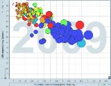
Gapminder World - This is the interactive, dynamic scattergraph that allows you to choose what you want on each of your axes and then play through 200 years of history. See the tutorial below on this.
The data - This gives you access to the 'oodles' of data to which I have referred. It is all downloadable as a spreadsheet and easily used. The only thing you might want to do is transpose the data from rows into columns. Again, see the tutorial video below.
The Videos - These are all worth watching. Perhaps teachers might want to choose carefully the bits they show to students so as to best meet their needs. We like them all but recommend 'The Joy of Stats' as good starting point.
The Downloads - This where you can get the ![]() Gapminder Desktop download that allows you to work with the tools without an Internet Connection. This is free and highly recommended.
Gapminder Desktop download that allows you to work with the tools without an Internet Connection. This is free and highly recommended.
Gapminder activities on the site

 Interpreting World Statistics
A matching exercise. Match the scattergraph with the country based on 200 years of health and wealth history. Use when teaching the interpretation of statistics. This has been used in particular by focussing on the impact of World War 2.

 AIDS-HIV Statistics
A logic puzzle designed to reveal some startling information about the impact that HIV has had on ourt world. In paricular this focuses on how sub-saharan Africa has been hiot the worst. Use when teaching about ratio, percentage or fractions. Also useable during any statistics unit. The activity might be used in personal education with tutor groups/home rooms around World Aids Day

 Dynamic Scattergraphs
This activity makes great use of Gapminder to encouarge students to search for relationships. Great when teaching scatter graphs and/or any data interpretaion exercises.

 Olympic Circles
This is an infographic activity based around the Olympics and relying entirely on Gapminder data. This can be used during any data handling unit and has a big cross over with circle geometry.

 World Village
This our latest gapminder based project and was inspired by a preview of some of their newest material about population growth over the last 200 years. There are numerous ways you could work with this but it all starts with a wonderful practicall visualisation activity. Follow the link for more details.
Connect with Gapminder
Here is the ![]() Gapminder facebook page
Gapminder facebook page
Here is ![]() Hans Rosling's Twitter feed
Hans Rosling's Twitter feed
