World Village

'If the world was a village of 100 people....'
This page is about a joint project done with the mathematics and geography departments and involving primary and secondary students at the International School of Toulouse. It was inspired by two key things. Firstly, an invitation from the people at the Gapminder foundation to look and give some feedback on some of their ![]() new resources, and secondly by the wonderful book entitled
new resources, and secondly by the wonderful book entitled ![]() 'If the world was a village of 100 people'. Both of these ideas inspired us to do something practical, fun and most importantly, really powerful with our students. The end result is something really rich with possibilities for engagement, creativity and mathematical and geographical exploration! This page is the explanation of the ideas, what and how we went about them, and eventually, the resources and activities we created to go with it. It has been a big effort and we hope that others can benefit from the work we have done and run similar exercises with their students! For Geography teachers, check out
'If the world was a village of 100 people'. Both of these ideas inspired us to do something practical, fun and most importantly, really powerful with our students. The end result is something really rich with possibilities for engagement, creativity and mathematical and geographical exploration! This page is the explanation of the ideas, what and how we went about them, and eventually, the resources and activities we created to go with it. It has been a big effort and we hope that others can benefit from the work we have done and run similar exercises with their students! For Geography teachers, check out ![]() Matt Podbury's perspective on all this. For the perspective of a primary teacher, read
Matt Podbury's perspective on all this. For the perspective of a primary teacher, read ![]() Simon Gregg's blogpost here.
Simon Gregg's blogpost here.
Video taster
Here is a time lapse video of students demonstrating the worlds population growth from 1810 and forecast to 2050. One student represents approximately 93 000 000 people.
What we did!
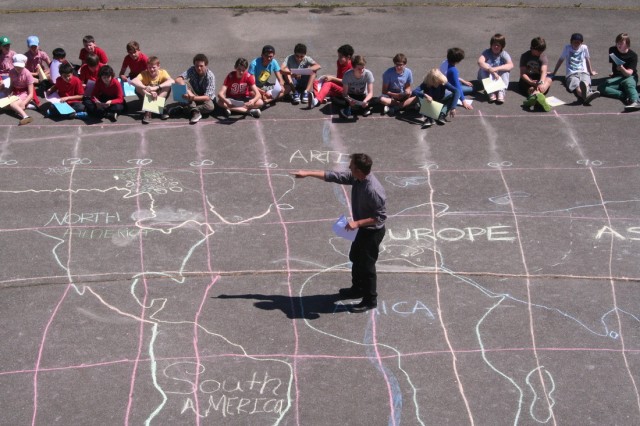
The aim was to create a range of images that represented information about our worlds population and some 'haves' and 'have nots'. There is a wonderful range of images already out there, but we wanted our students to make the images themselves. When thinking about representing populations, we thought, what better than people? When asking to imagine the world as a village of 100 people we thought, what better than doing it with 100 people? So we got 100 students together ranging from 9-13 years in age, drew a huge map of the world on our playground (using a grid system - thanks Mr Gregg, yr 5 and yr 12) and gave students instructions on where and when to stand on the grid. I was allowed on to the roof of the school to take the pictures and video, while my colleagues got the students organised on the ground! The hard part was preparing all of the instructions. I went back through all the population data and had a lovely time doing the mathematics involved to create 100 different instructions cards that told students where to stand, when to stand there and what colour paper to hold above their head. I did this for all of our population changing over time data, whilst our geograpghy teacher, Matt, worked on the cards for 'If the world was a village of 100 people'. Both sets of cards can be found here so the exercise can be recreated.
The Cards and numbers
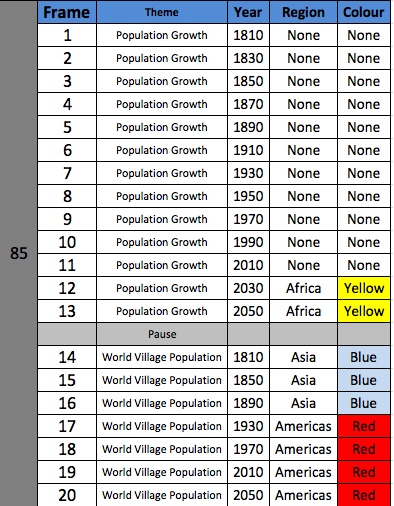
Here are the cards we created and used to run the simulation activity. ![]() Population cards,
Population cards, ![]() World Village cards. Here is a summary of the numbers used for the population cards -
World Village cards. Here is a summary of the numbers used for the population cards - ![]() Population Numbers
Population Numbers
They look like this for the population stuff, frame 1 - 20.

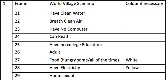
and this for frames 21 - 30....

Three key Themes
Population growth from 1810 - 2050
This was done in 13 stages, with a frame every 20 years. This is what can be sen in the video above. So we shouted '1' and students followed the instructions next to 'frame 1' on their cards. In the beginning most students were still on the sideline, but by 2050, as you can see, every student was on the map. The 13 frames are shown in the slideshow below.
Population by proportion
Remembering that the initial idea was about 'what if the world was a village of 100 people?' we wanted to show how that would be different over the years. With that in mind, the next 7 frames on the instructions cards showed the percentage of the worlds population in each of the 4 regions starting in 1810 and jumping 40 years at a time to 2050. Here are the photos of those results.
It is great to watch these and look for the things that are changing!
If the world was a village of 100 people
The following frames show the the world divided by a number of key indicators like access to clean water and so on. Watch and look for some startling facts!
Maths Activities
This was great to do and it has already been a rich, enjoyable and reflective experience for us and our students. We really want to make it count, though, with some great follow up activities. The following are the ideas that are taking shape. In time resources will go here to compliment these activities.
Discovering ratio
I want to use these pictures with 11 yr olds to pull out the need for ratio and simplifying ratio. As you look at the pictures, how do you describe the relative amounts? 'There are a lot of Asians for not many Americans' .... will students want to use expressions like 'twice as many'? and so on. At what stage will they want/need to use numbers? Who will be the first to say something like 'there are two Europeans for every African'? This activity will be about using these images and numbers to draw on a natural, intuitive use of ratio. Here is a ![]() first draft of an activity and below a video that might explain.
first draft of an activity and below a video that might explain.
The World Village logic puzzle
I love using logic puzzles! In this case, I am going to produce a summary of many of the world village stats only without the numbers being in the right place. I will make a series of clues given as ratios to help students work out where the numbers should go. In doing so they will be practising ratio and discovering some intersting realities about our world village.
Here is a first draft of the puzzle that I am going to trial with students ![]() Empty Grid
Empty Grid ![]() The Clues
The Clues ![]() The Answers
The Answers
Modelling population growth
I have done an excellent exercise here with older students. I gave them a data table on the population growth with many of the numbers missing. They had to fill in the numbers. There were some lovely conversations about the way the numbers were growing and thus, what the best model was. For example 'what goes between 1 and 2 billion? If we put 1.5 then we are suggesting linear growth and the rest of the table is not like that.' The conversation was great. I then gave them the missing numbers and so it continued.
Following that, we started to try and model population growth until 2010 with an exponential model. This can be done with Africa, the Americas and Asia, but not so easily with Europe. Students used their models to make predictions up to 2040. Then we compared these to the UN predictions and this is where the conversations got really interesting.
Here is the ![]() Population Grid with blanks on it that I used to start this exercise. Here are the
Population Grid with blanks on it that I used to start this exercise. Here are the ![]() Population grid answers
Population grid answers
Below are some photos of a display made from the different modeling exercises.
Presentations - Although less obviously mathematical in nature, I want to give students the time and space to look at these numbers for themselves and draw some of their own conclusions. I have already asked them to use a variety of media to work with the images we have made towards presentations of the information. Without being too prescriptive I have asked them to make references to numbers, their impact and the way they are changing. I hope to be able to post some student work here too.
Other ideas....
There are so many things that we could do with these numbers and images, I just havent got time to do them all with my students! Here are just a few other thoughts I have had..
Match the graph - Produce graphs of the population growing in each of the regions and get students to match them with the region. This could be broken down in to countries as well. there must be other potential for matching exercises here too. How about match the ratio to the picture?
Making the Spreadsheet - I had a lot of fun working with the raw population data to work out how many people to put on the map in the different places for the different years. This task was very rich in terms of percentage and proportion, along with programming and formulae. Another time, I think I will want some students to do this bit of the job.
Which ratio best fits? - There is an interesting tension here, in that this task has involved so much estimation and rounding in order to make it possible. When is it too much? For example, if at a given moment in time there were 61 Asians for every 23 Europeans, what is the most useful way to express the ratio. Since 61 and 23 are both prime, we know we cant cancel the ratio down any further, but would 3:1 not be easier for people to understand? I have in mind that we must be able to pick out a number of ratios with awkward looking numbers and ask students to pick the best approximation where they might have to balance accuarcy with the need to be easy to comprehend. In doing so, I can imagine lost of proportional reasoning.
Related Links and resources
In preparing for this exercise, I made reference to a number of things that are linked to below including the website about the book that got us going in the first place!
http://www.visualnews.com/2011/05/18/if-the-world-were-a-village-of-100-people/
https://pinterest.com/specialk_522/if-the-world-were-a-village/
http://www.youtube.com/watch?v=FtYjUv2x65g
http://www.youtube.com/watch?v=jNnbO8x4JAY

