Comparing Data Distributions - TN
 Teacher Notes
Use this fun, fictional set of results on a number of levels! Processing data, calculating averages, quartiles, ranges and more. Most importantly this resource is great for comparing distributions. The data is full of surprises and two sets might have some things in common and other things really quite different!
In response to headlines that ‘Monkeys will do just as well in today’s multiple-choice maths tests, students have to compare the results of 23 Boys, Girls, Monkeys, Martians, Flying pigs, Babies and Robots in the same test. It is an exercise in looking at all the measures of central tendency and dispersion to see what the sets have in common and how they are different. The key is in the data - see below - and the hidden surprises. The main observation is that despite the very different distributions, they all have the same mean average.
The presentation below is a copy of the one on the student page but with the answers to the matching exercise thrown in.
How to run the activity
This is the key question for teachers.
- In its most open format, you just give students the data and ask them to perform the analysis and presentation. You could split students in to groups and give them one set each or get them all to do it all. Much depends on the age of the students and the aims you have as a teacher. You could use the data as a tool for making stem and leaf diagrams and getting quartiles from them. It can be used as a vehicle for calculating averages and measures of dispersion, either with calculators or with computers and data processing software. There are a few choices to be made.
- Another approach is to give students the data and the matching exercises. This is a different, and perhaps slightly more approachable task and will bring out a different set of reasoning skills from students.
- It is possible to do both of the above. The main thing is to decide beforehand how you are going to run it!
The Data
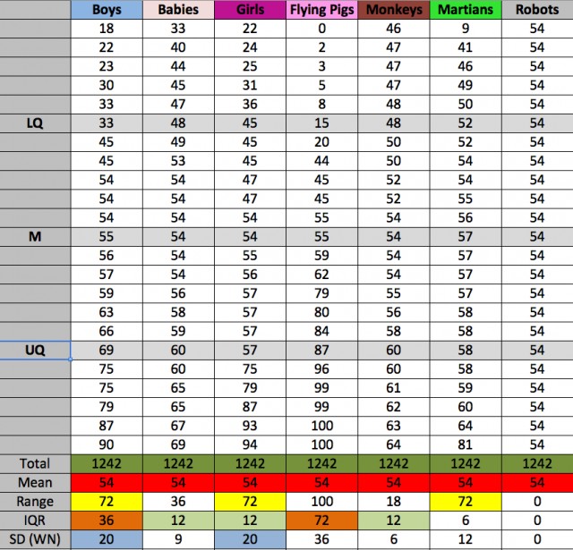
Here is a screen shot of the data, which has been ordered and processed. You can see the relationship between the sets. Some of them have the same range, some the same IQR and 2 have the same Standard deviation. All of the means are the same and all of the results can be expressed as multiples of each other, with the number 6 being the base.

Here is ![]() The processed data in excel. For any users with access to the highly recommended
The processed data in excel. For any users with access to the highly recommended ![]() Autograph software, here is an
Autograph software, here is an Autograph stats file that can be used to create the box plots and histograms and calculate statistics.

