Scattergraphs - 15 Countries

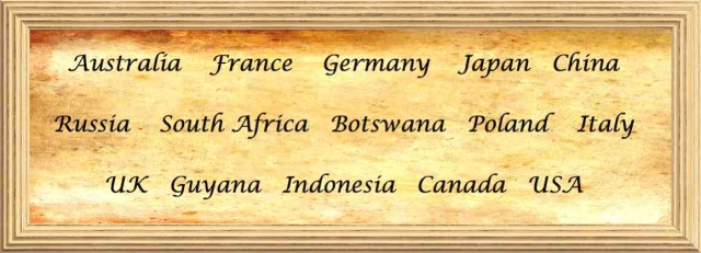
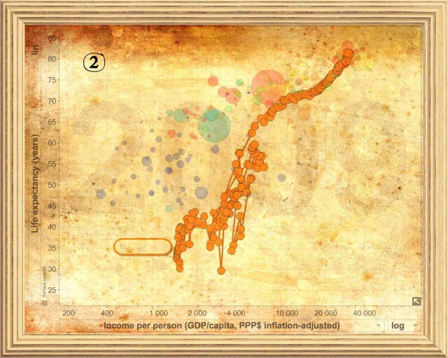
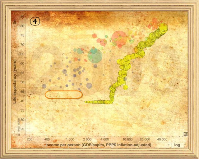
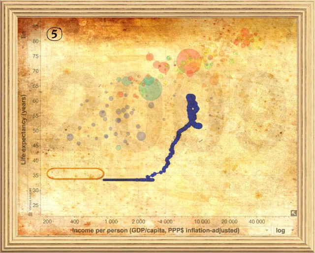
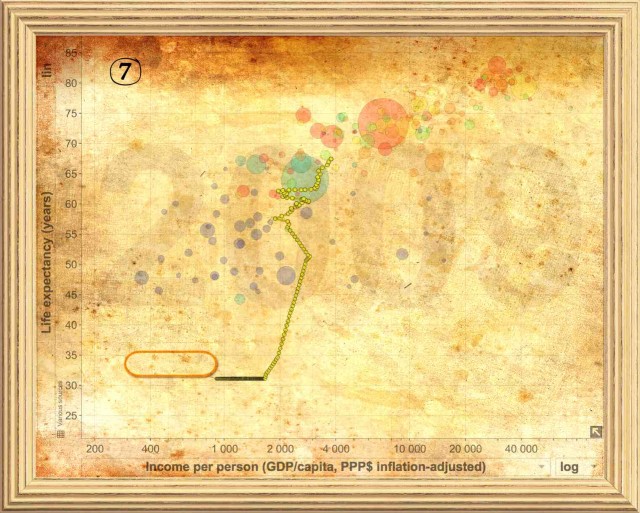
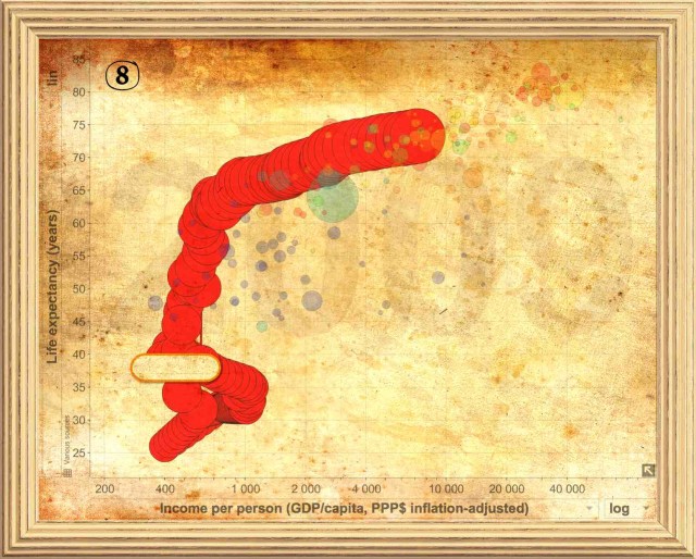
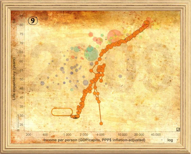
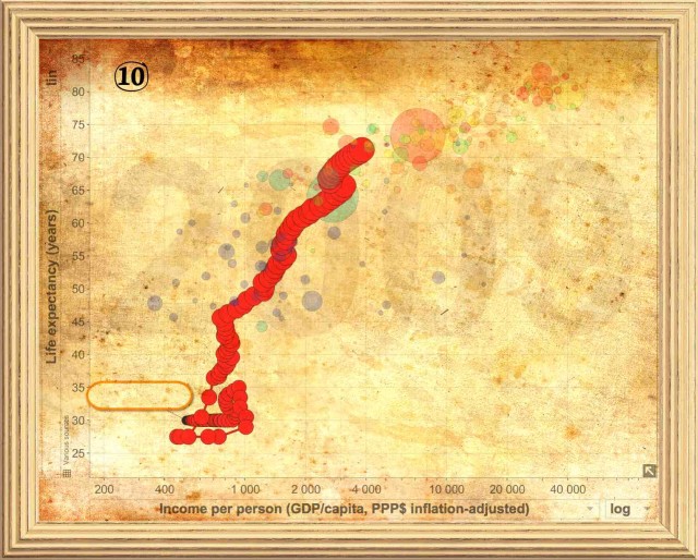
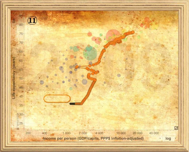
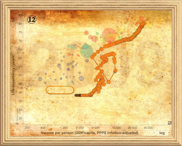
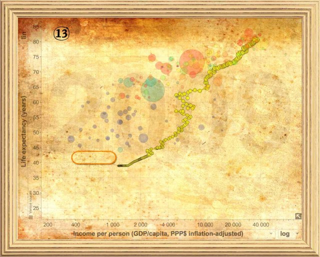
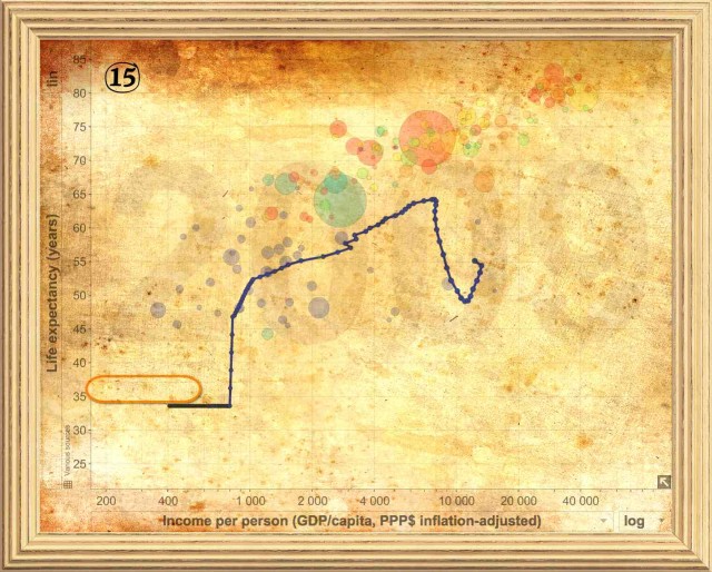
Match the scattergraphs with the countries!
This task is really easily explained! Simply decide which of the scattergraphs goes with which of the countries. To do this it might help to consider the following points. In the general, the graphs start in the year 1800 around the bottom left and finish in the top right in the year 2009. There are some exceptions. The General direction moves from bottom left to top right, but it is when this is not the case that the graphs begin to tell you something about the country. Consider when and why life expectancy increases or decreases and try to relate this to historical events. Consider when GDP per capita increases or decreases and try to relate this to historical events. Group some countries that you think have something in common. Consider what is represented by the size and colour of the circles and how this might help you narrow down the countries.




Answers
The solutions can be found by clicking on the show button! Please resist the temptation to look ahead of time as this will rather spoil the activity!

1. Australia
2. France
3. Russia
4. USA
5. South Africa
6. Japan
7. Guyana
8. China
9. Italy
10. Indonesia
11. Poland
12. Germany
13. Canada
14. UK
15. Botswana

